Turn your project data into meaningful insights with AI-powered personalized dashboards
In a world where speed and clarity drive better decisions, teams can’t afford to wait for insights. With Planisware's AI‑powered end‑user reporting and one‑click personalized dashboards, every user can instantly turn their project data into meaningful, visual intelligence.
The Feature at a glance
The End-user reporting feature enables users to effortlessly create personalized dashboards and widgets by combining native reports and custom queries, guided by an AI wizard. From generating smart visualizations to assembling dashboards with drag and drop simplicity, insights are just one click away.
Who is it for?
- Project and product managers who need instant visibility into their project priorities
- PMOs and delivery teams seeking fast, consistent reporting
- Any team member who needs professional dashboards without technical complexity
Image
Why project teams love this feature?
- Accelerated time to insight
Skip configuration and reporting setup, dashboards are ready instantly. - Effortless personalization
Mix and match widgets from native reports and custom queries to fit your needs. - AI guided chart creation
Generate relevant, insightful visualizations in a single click with the AI wizard. - Higher adoption and engagement
Empower every user to build polished, professional dashboards independently and confidently.
Let's see Planisware's End-user reports in action
Personalized Dashboards Within Reach for Every User − In a Single Click
Transcript
You can now empower every user, regardless of technical expertise, to instantly build the perfect project dashboard. With Planisware's new One Click Personalized Dashboard Creation feature, teams can now transform data into insight faster than ever before. No configuration steps, no setup complexity, just immediate, meaningful visibility.
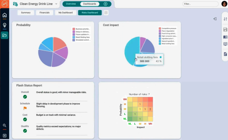
Hi, I'm Isabella. As the product manager, I must understand risks early to adjust scope, sequencing and priorities before issues escalate. I want an instant, visual overview of how project risks impact both probability and cost. Using the AI-wizard I can quickly generate a clear, insightful chart to guide better decision-making. I'll choose to represent it as a pie chart, guided by the bot that analyzes the risks table data and suggests relevant visualizations. Once generated, I can easily publish my chart for user reporting to make it available for my dashboards. On my project dashboards page, I can create my own dashboard with a single click.I'll search for the charts I generated with the AI-wizard. One of them represents the probability and the other the cost impact of the project risks. I can build my dashboard by adding widgets with a drag and drop and resize and reorder them as I please, and all in a heartbeat! I can build my dashboard with a mix of native reports and custom queries to get all the insights I need.
With user reporting your teams no longer need to spend time configuring layouts or navigating reporting settings. users can create their own, personalized dashboards effortlessly. To make personalization even more powerful, the built-in chart wizard guides users in creating context aware queries, analyzing the data to suggest relevant chart visualizations. User reporting feature turns dashboard creation into an intuitive and frictionless experience, increasing user adoption and engagement.
With End-user reports your personalized dashboard insights are just one click away. Want to learn more? Schedule a personalized demo today.